Wonderful Wedding Cakes
Rebranding for a custom cake shop

Type of Work
UI / UX Design, Graphic Design
My Role
Researcher, consultant, and designer.
The Challenge
Take an existing website and make it more visually appealing, easier to use, and more intuitive to the user. As well as create a custom contact form making a more streamlined ordering process for a made to order business model.
Researching the competition
When starting my research, I knew I wanted to do some competitive analysis on other similar websites just to get an idea of how those looked and what functions they had. I found that most of them looked pretty similar. From there, I knew wanted to create something different. I wanted it to grab you when you first get to the landing page, something that makes you say "wow" and want to keep digging in to see what else they have to offer.


Mapping out the flow
Task Flows
I created user flows based on common tasks that the target user would do on the site. This was to ensure that every page needed was included and we would eliminate unnecessary pages, less is more. This is an example of one user flow to access the gallery page. It was important to me to make sure that there were several different ways to get to important pages, such as gallery, contact and order page.

I started sketching out various screens starting with the landing page to see which layout made the most sense.

Style Guide
The original colors used in the logo, were a chocolate brown and pink. I decided to keep those colors to keep the familiarity of the brand.
I did, however, change the typeface of the logo. The original script was very formal and in certain instances hard to read. So I went with a simpler script which still keeps the upscale, formal vibe. For the remaining fonts I went with a simple, easy to read sans serif.

Old typeface

New typeface

Mid to High fidelity mockup
The mid fidelity wireframes became pixel perfect and with color added they are brought to life,


Before / After
Here is a side by side comparison of the old website vs new. Please click and drag on the center arrow and swipe left and right to reveal.
Prototype
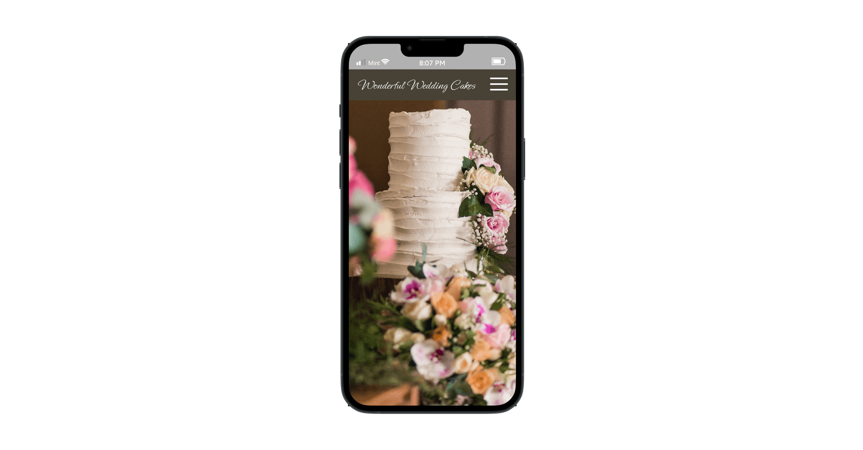
Final design
With high competition and a constantly growing number of mobile apps devoted to the theme of food and baked goods, the first impression cannot be just nice and clean. The successful app, in this case, should instantly appeal to the emotional and aesthetic sides of user perception and be simple to use to engage the user from the first seconds and let them interact according to their personal preferences. That’s the balance I strived for in the case of Wonderful Wedding Cakes.
“Design is intelligence made visible."
— Alina Wheeler, author